
By Varun Raturi,
INFUZE is built around a simple idea. The people of Leeds should be able to help design how the city moves. Residents, community groups, local organizations and policy makers play a vital role in shaping the project by participating in surveys, workshops, focus groups, and helping to design and try out new services. They are not an audience for the research. They are part of it.
The challenge is how to present a growing collection of data to that group. Behind the project sit bus boardings, shared bike trips, vehicle speeds, footfall and census figures for every ward. Our job is to make these datasets accessible. But a table of model results, or a page of descriptive numbers, is not very engaging for someone who has given up an evening to help shape their neighbourhood. We needed a way of showing the data that people would actually want to look at.
A dashboard instead of a report
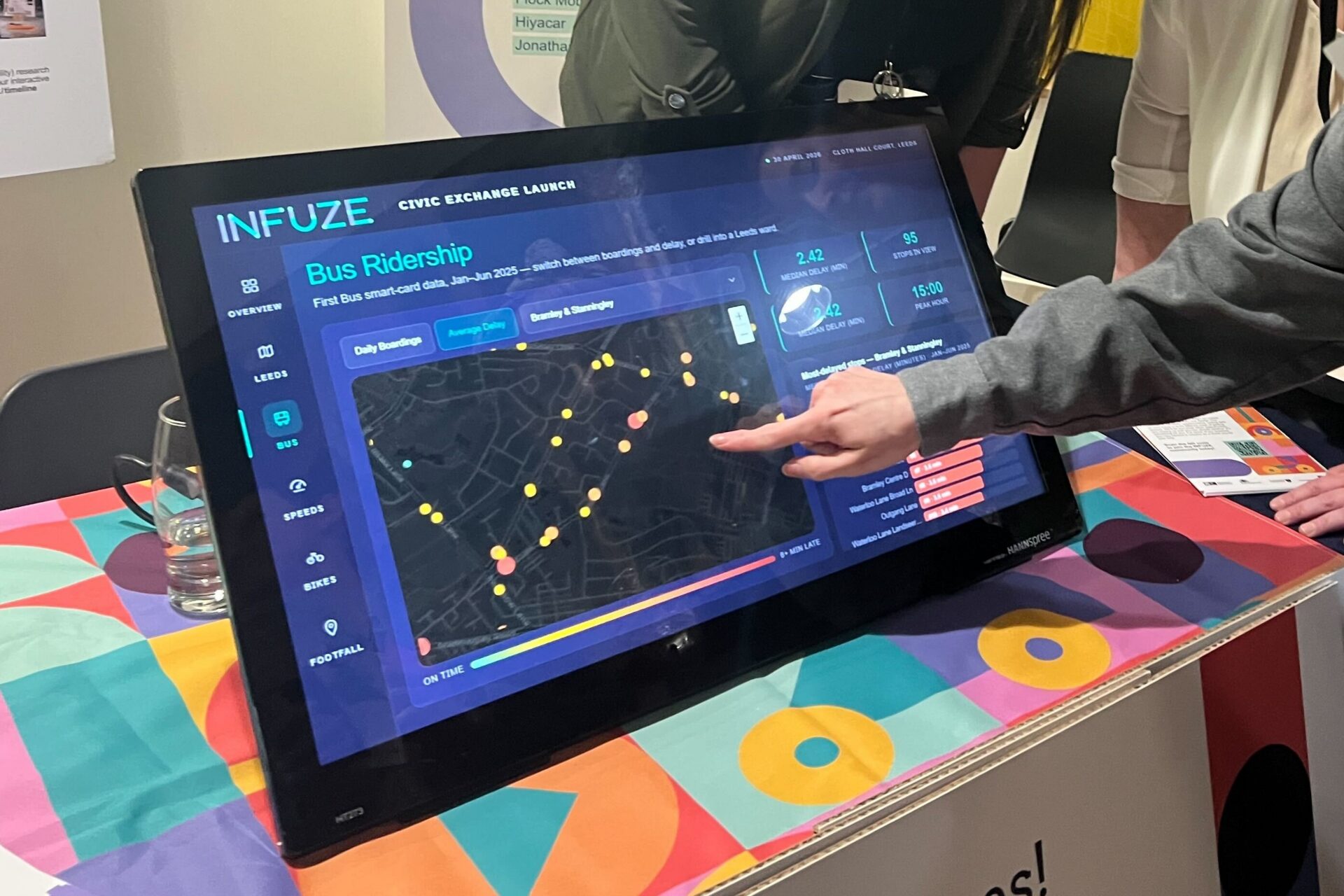
So we built an interactive data dashboard. Rather than reading numbers in a report, you pick a map and tap your own ward.

Behind it are datasets from our partners. First Bus boardings, Beryl bike hires, goods vehicle speeds from COMPASS telematics, anonymised footfall estimates from Locomizer, and ward-level census figures. Everything on screen is a summary. No individual journey is shown. What you see is what the data holds for your area, such as how busy your bus stop is through the week or how fast traffic moves on your road.
The data dashboard’s first outing was the University of Leeds Civic Exchange launch in April, on a touchscreen at Cloth Hall Court. People spent a long time at the screen, moving between wards and datasets and comparing their own area with the rest of the city. Of the five datasets, the bus data was the most popular. Visitors wanted to know how reliable the buses were at the stops in their ward, and why some routes ran late more often than others. The screen also prompted questions about the research itself. What are these datasets for, and what does INFUZE plan to do with them?

What comes next
The data dashboard shows Leeds as it is. The next tool will show what might change.
We are building a second dashboard for the project’s agent-based transport model, which simulates thousands of individual travellers and examines their everyday choices across the city. The new dashboard will let you compare policy options, such as cheaper bus fares or fewer parking spaces, and see how travel patterns across Leeds might respond. It will also explain how the model works. At the moment we have an early version, running on illustrative results until we have enough data for the model to produce its final outputs.
We are discussing bringing both dashboards into our upcoming community and collaborative design workshops, so that groups can explore the data while they discuss ideas for the city. Our hope is that this becomes ordinary practice. When a project gathers data about a place, the people who live there should get to see it in a form they can understand and question.
If you live in Leeds and would like to get involved shaping the future of our city please join our mailing list to hear about upcoming opportunities to get involved with our work.